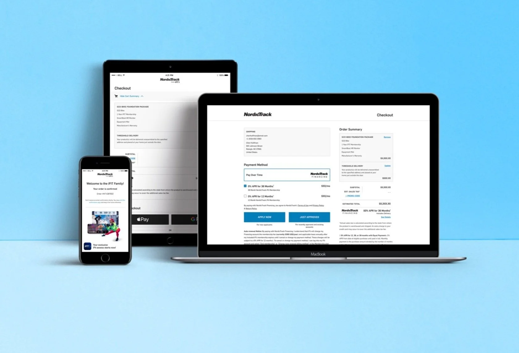
eCommerce Responsive Cart Flow // NordicTrack
UI Design Project
Overview
NordicTrack.com is the responsive eCommerce site for the NordicTrack brand, which boasts hundreds of thousands of shoppers, and multiple millions in sales per year.
Problems to Solve
Our site’s cart flow was reviewed in a Mobile Garage Workshop by both Facebook and Branding Brand to determine pitfalls and obstacles to our users’ mobile shopping experience. 78% of all our site traffic comes through mobile, but conversion rates did not match that level of performance. The audit revealed the need for extensive changes to improve the checkout flow. In summary, here are the changes we worked to fix:
Provide a traditional cart experience
Allow users to view a cart summary prior to entering the checkout flow.Improve checkout process steps
Total price is not viewable at each step along the checkout, leaving users to try and remember it when placing their order. Also, shoppers do not have an order review option prior to placing their order, often leading many to accidentally complete their order before they’re ready.
The Process
Mobile First Design
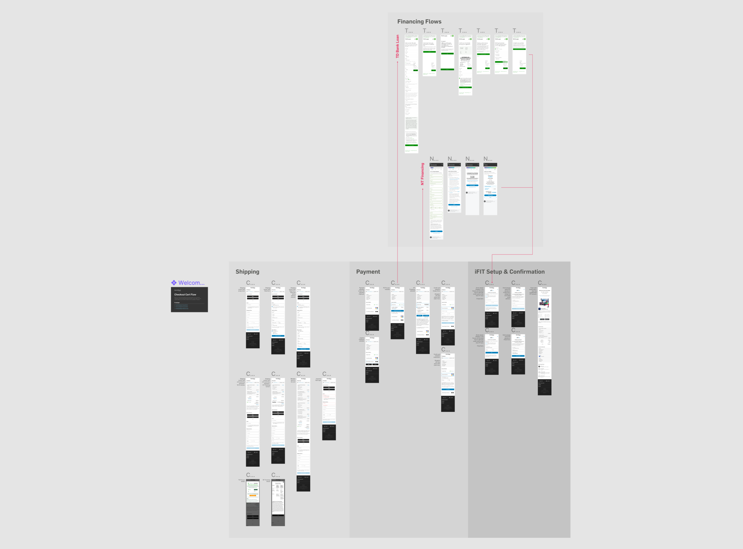
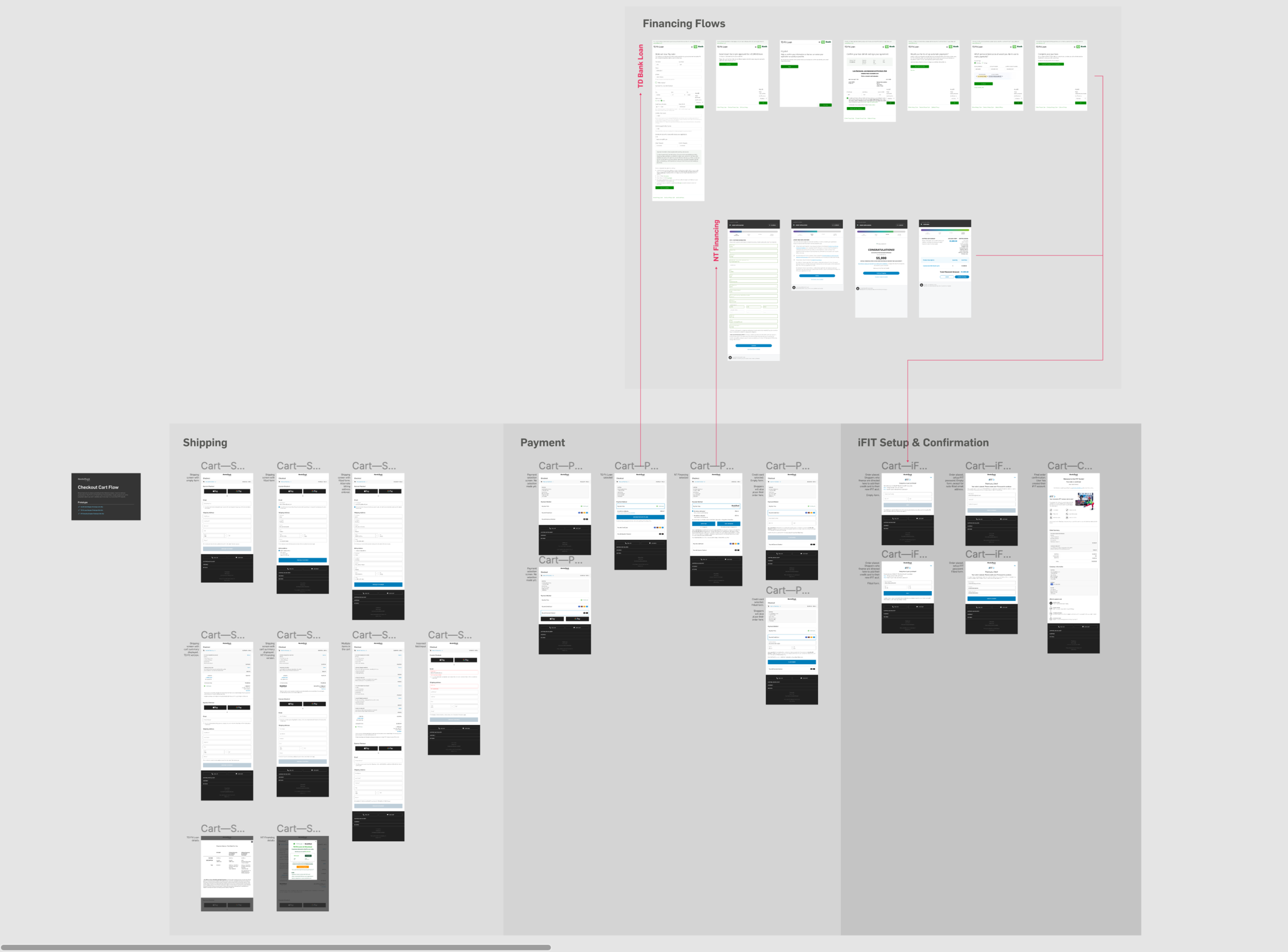
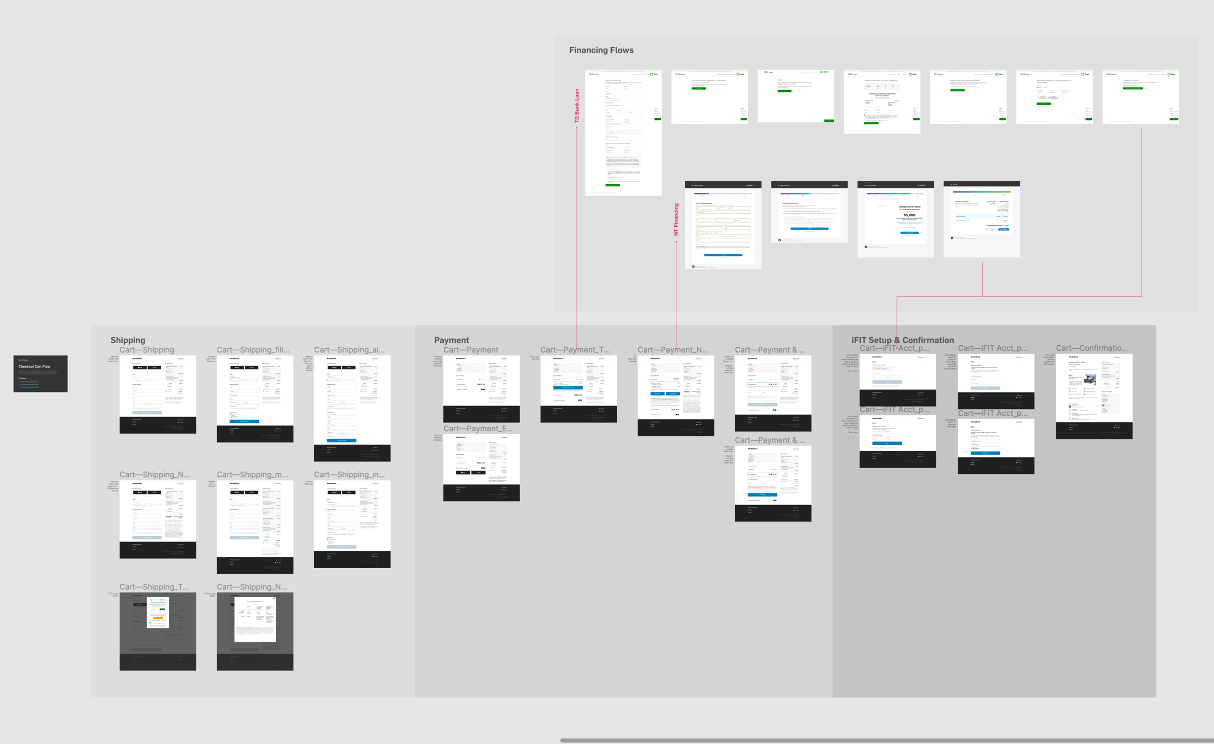
Taking a mobile first approach, I began designs for each screen to accommodate mobile. I first ensured that each essential screen for the flow was created, then added the alternate instances of those screens.
Building Components & Linking to Design System
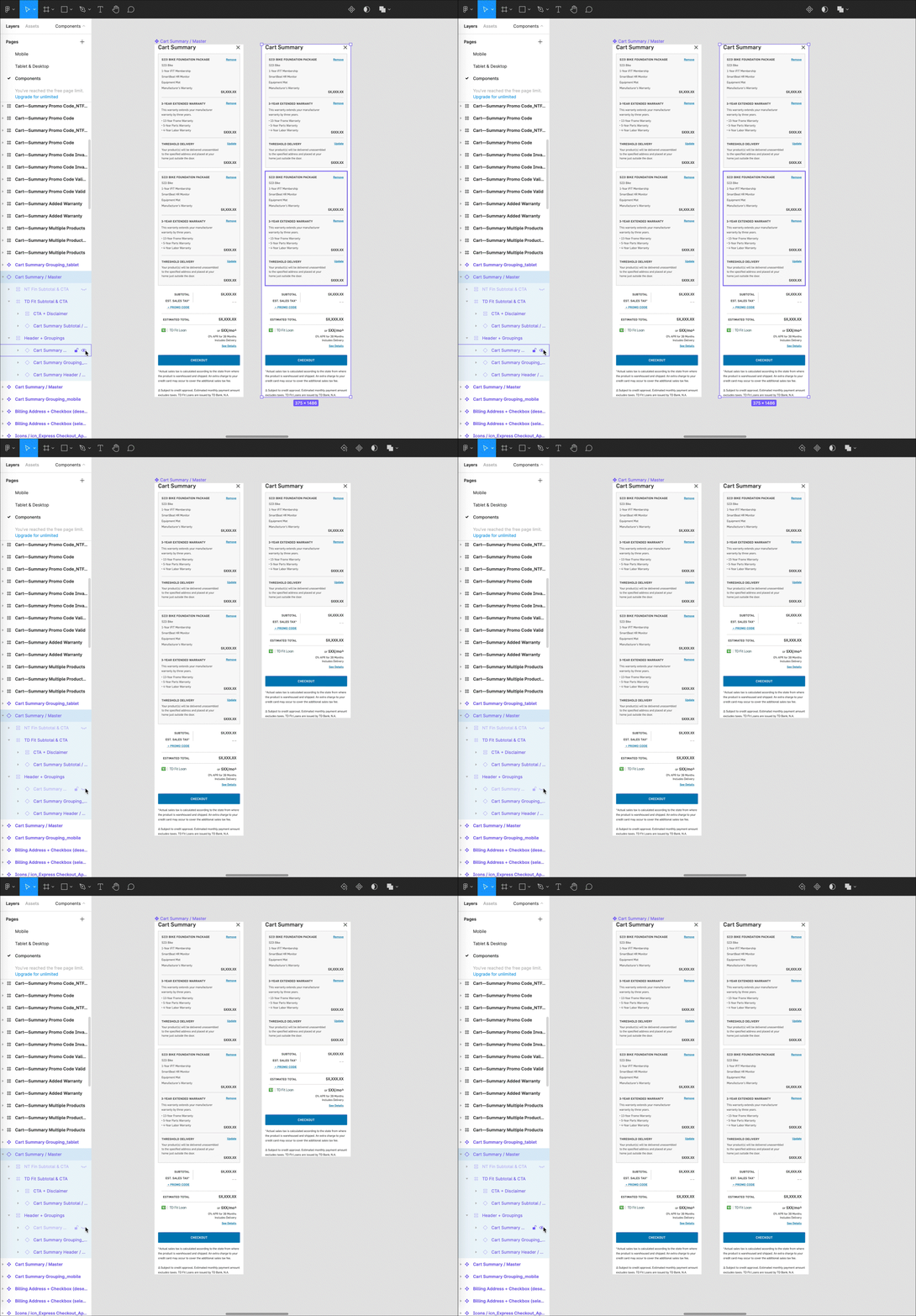
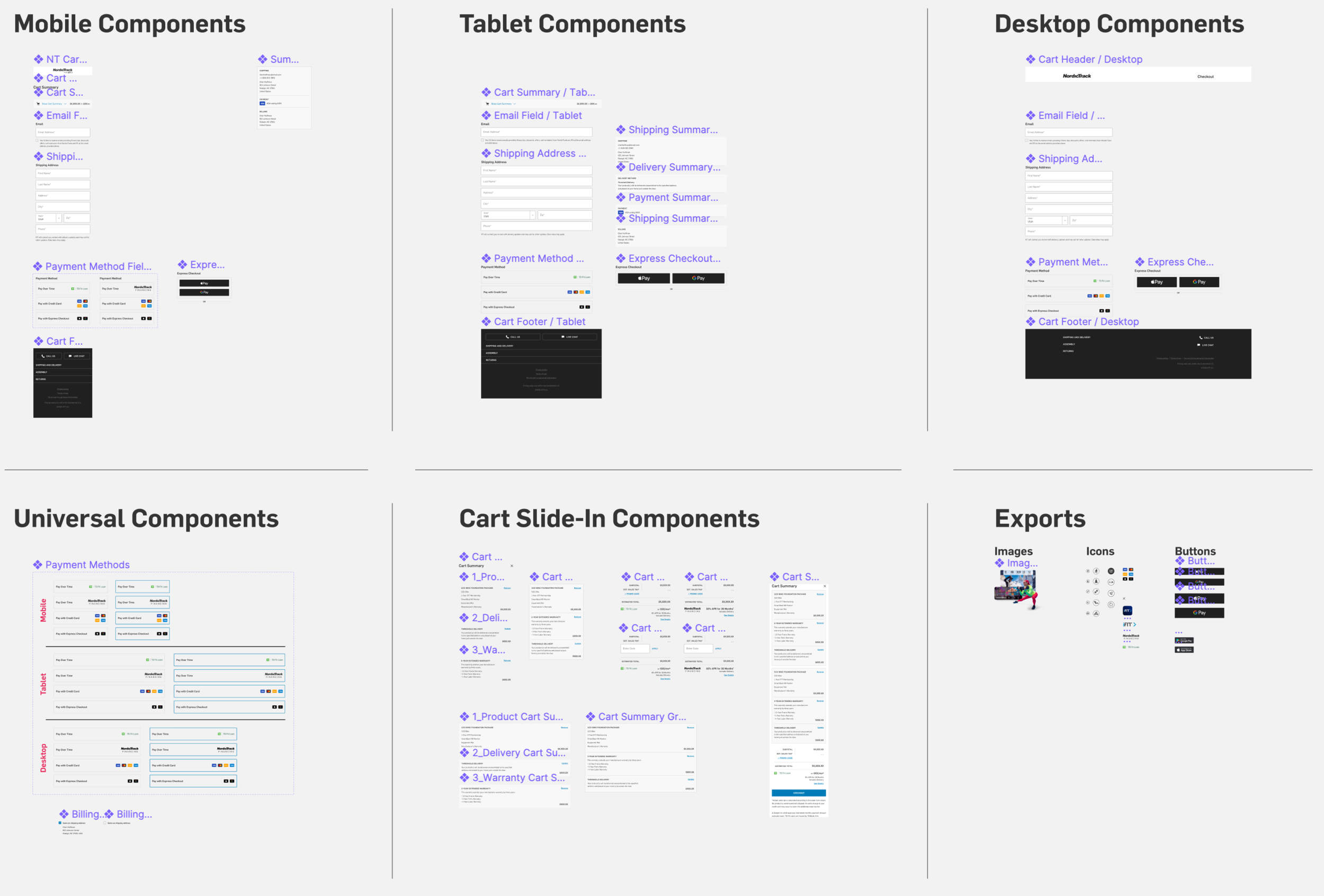
I created 74 individual components, along with four component sets. Nested components and auto-layouts were used wherever possible to allow for easier editing and automated responsiveness on the screen designs. This project was also worked on concurrently with our team transitioning to using Figma from Sketch. As such, we had to build out and develop a design system, then link text styles and components to that system.
Reviews & Iterations
Reviews were done by numerous members of senior management, including Ryan Dunkley (VP of Direct to Consumer Commerce) and Joel Dewberry (VP of Global Marketing & eCommerce), as well as our development team. We went through numerous iterations addressing the aforementioned goals:
1. Provide a traditional cart experience; 2. Improve checkout process steps. These are the notable highlights:
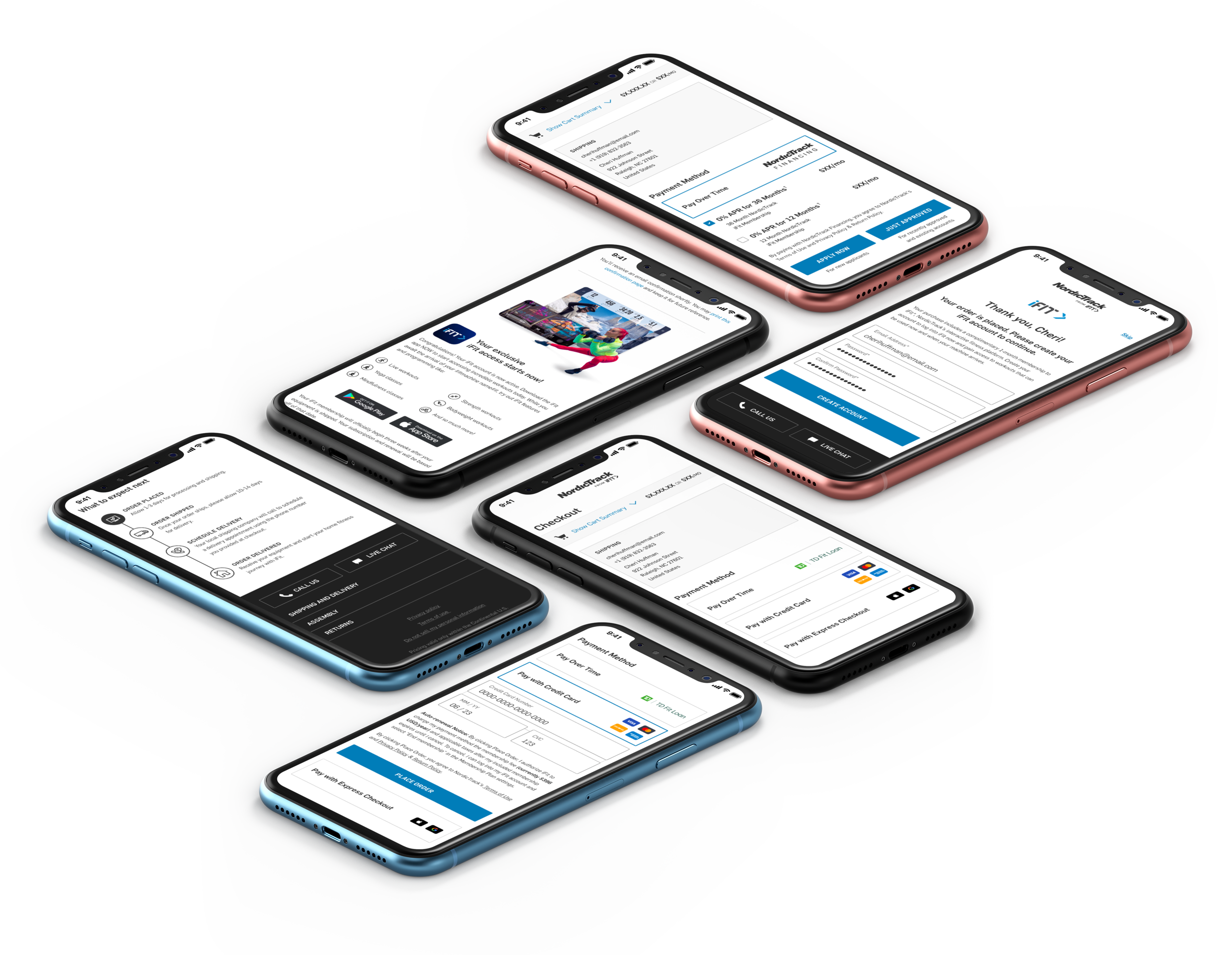
Complete redesign of the cart flow interface. This brought new consistency to text styles, buttons, and overall content layout.
Addition of a drop-down cart summary that is accessible throughout the entire cart flow.
Addition of a screen for financing shoppers to add their credit card to their new iFIT subscription.
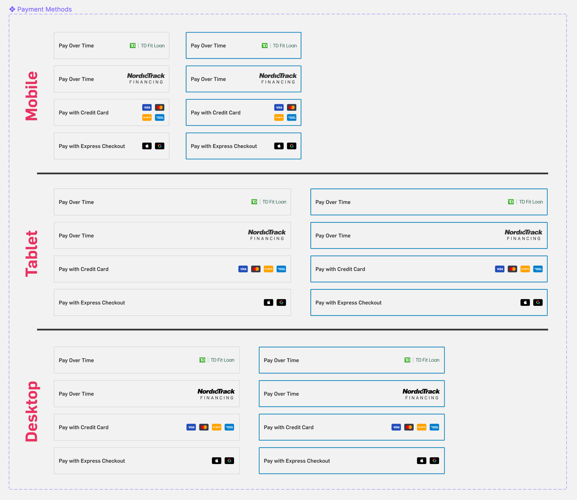
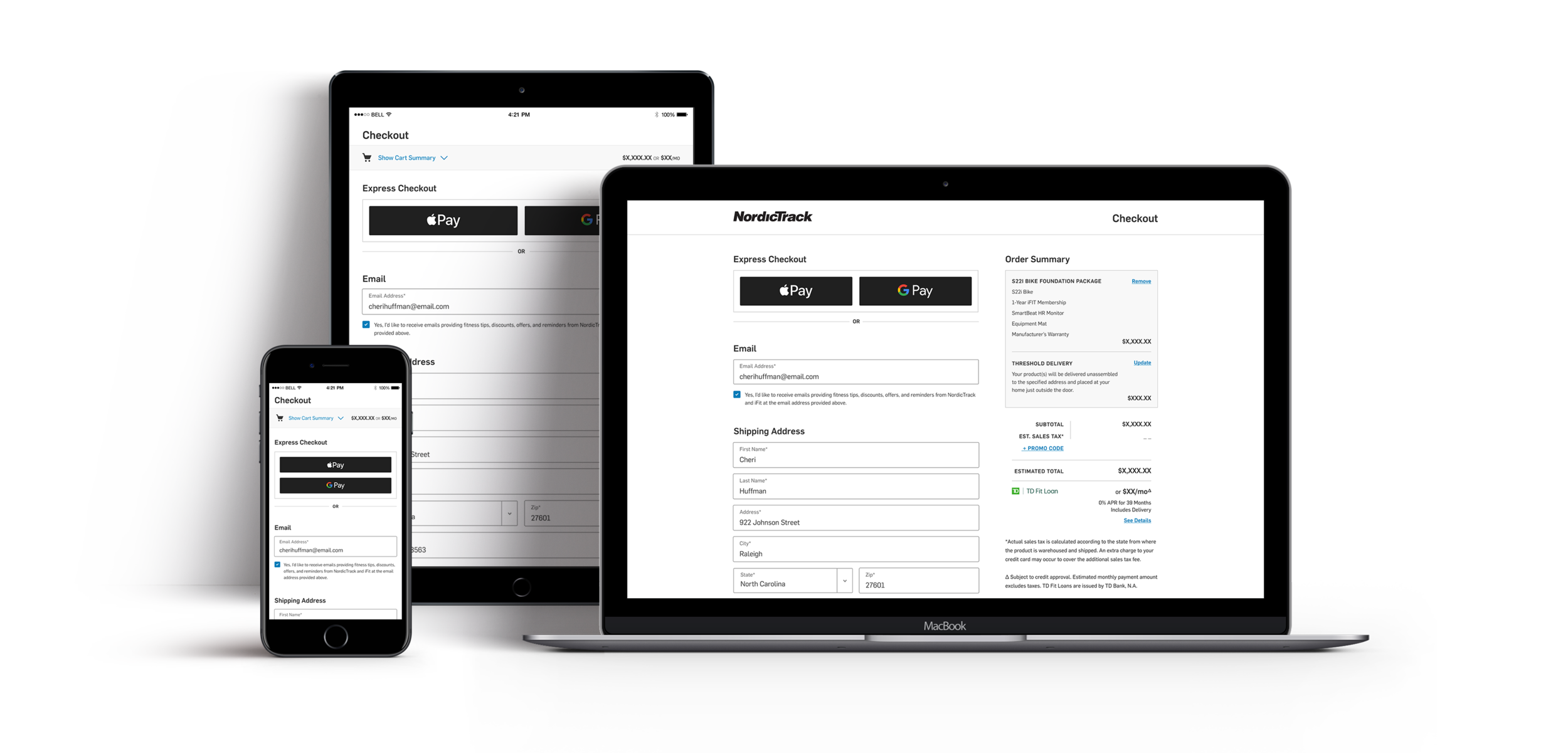
Addition of Apple Pay and Google Pay express checkout options.
Addition of an order review screen that enabled shoppers to fully review their order prior to placing the order.
Responsive Breakpoints
Final mobile designs were then spread across tablet (780 px) and desktop (1440 px) breakpoints.
Prototype
To demonstrate the user experience and sell project stakeholders on our design solutions, I prototyped the mobile flow. Explore the prototype for yourself here.
Design Deliverables
Retrospective
What Went Well
My component library became extremely helpful in keeping consistency throughout all design elements.
I built each screen utilizing Figma’s auto-layout, thus allowing the content of each screen to be automatically responsive to changes and iterations. This improved my workflow.
What Didn’t Go Well
Due to time constraints, our first hand-off was done prematurely. The cart review screen had to be removed, and express checkout options were not available on the payment screen.
Since this project was done while we were learning how to use Figma, that slowed our overall progress until we were able to establish our design system and workflows.
Collaborators
Ty Taylor, NordicTrack Brand Marketing Manager // Brianna Bybee, Creative Director // Chris Olsen, Senior UX/UI Designer
Like what you see?
Please reach out to me! You can find my information on my contact page.

